BI
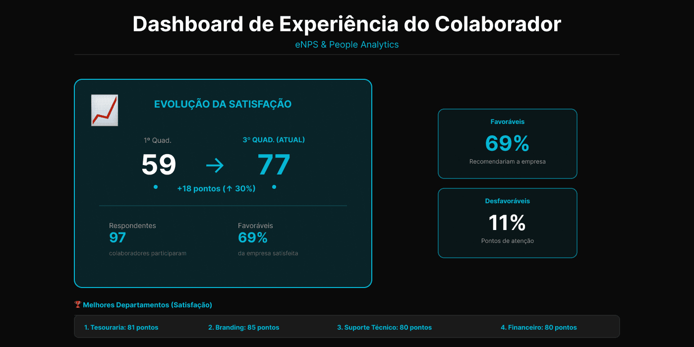
Employee Experience Dashboard — eNPS
Replaced 200+ manual slides with dynamic People Analytics insights
The Problem
For each organizational climate survey, HR needed to extract a CSV report, manually create charts, capture screenshots, and prepare a presentation with over 200 slides. This process was extremely time-consuming, repetitive, error-prone, and metrics were only analyzed at presentation time, with little flexibility for deep analyses.
The Solution
I created an interactive dashboard in Power BI that analyzes overall employee satisfaction, compares results between surveys, identifies improvement opportunities by area/pillar/leadership, and supports preventive actions to reduce turnover risk. Includes historical consolidation of all surveys, favorability classification via score ranges, leadership analysis even with anonymous surveys, and dynamic word cloud of comments with stop word treatment.
Tech Stack
Impact Generated
- Drastic reduction in HR time spent preparing analyses
- Elimination of extensive manual presentations (200+ slides)
- Greater clarity and objectivity in reading results
- Possibility of continuous analyses, not just point-in-time
- Generation of previously non-existent insights
Survey Frequency
Four-monthly
Before Automation
200+ slides
Users
HR, Board, Leaders
Tech Stack
Overview
BI
Technical Stack
Technical Challenges
- Creation of calculated columns for quarter and favorability
- Comparisons between surveys with irregular intervals
- DAX measures for historical evolution
- Word cloud implementation with stop word treatment
- Relationship with external leadership base